Category Archives: Copywriter

Only engage…

…was the title – and theme for that matter – I came up with for a brochure for a design/branding company many moons ago. It still seems to me a perfect encapsulation of the key challenge facing any would-be communicator: to initiate a two-way process. Where you take that process comes next…

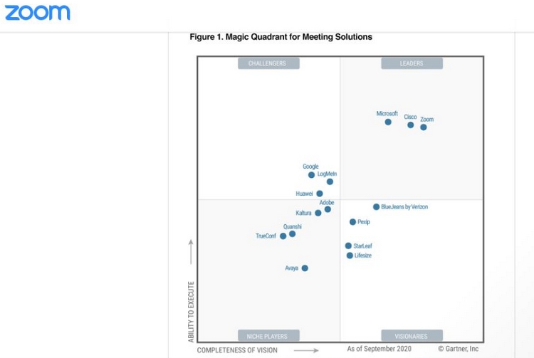
It was brought back to mind recently when I logged off a Zoom call to be confronted with:

This picture, featuring just 31 words (who needs ’em) isn’t one-way communication. It’s inherently relational; it invites you in. You have to figure it out. (Who can resist a puzzle?) And it’s intuitive enough that you can’t not. You engage. That’s the whole ball game right there.

It’s the old door to door salesman’s foot in the door. “D’you mind if I use your bathroom?”

Then it’s just a matter of

  • Hook – “Magic quadrant”?
  • Line – Zoom: a Leader
  • Sinker – © Gartner, inc.

The upshot, Zoom deliver the payload of their message direct to your brain: Gartner say we’re one of the top three (and none of the others matters).
“Are we done?”

Re-reading Eric Newby’s ‘Short walk in the Hindu Kush’ put me in a travel-writing frame of mind, so I shamelessly grabbed a Bill Bryson off the shelves. Never lets you down. Here he is on the Henry Ford museum in Dearborn, Michigan, which is

…filled with the most indescribable assortment of stuff – machinery, railway trains, refrigerators, Abraham Lincoln’s rocking-chair, the limousine in which John F. Kennedy was killed (nope, no bits of brain on the floor), George Washington’s campaign chest, General Tom Thumb’s ornate miniature billiard-table, a bottle containing Thomas Edison’s last breath. I found this last item particularly captivating. Apart from being ridiculously morbid and sentimental, how did they know which breath was going to be Edison’s last one? I pictured Henry Ford standing at the death-bed shoving a bottle in his face over and over and saying, ‘Is that it?’


Copy that

Going through the user guide for my new Chromebook, it’s immediately apparent just how far the world of corporate copy has come from the stilted, strangulated officialese that disfigured the language for so long.

‘you get the gist’….’other stuff’….excellent. Clarity, simplicity, a human voice. It took awhile, but vacuous polysyllabic pomposity seems at last to be on the retreat.

Cheers!

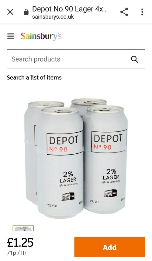
Came across an interesting site last week, essentially a direct-sales operation for a DIY brewing device:

https://thegreatergood.co.uk/

What’s interesting? It’s the first site I’ve come across that’s basically an ad on a loop: the offer, reduced to its barest essentials and presented using a handful of slick images and a few carefully-chosen words. The onus being on the browser to dig, if they want to find out more.

It brought to mind a project from maybe 30 years back, working on a brochure for Michael Peters Design, who’d recently done a retail project in Japan for a top British clothing brand. In stark contrast to Japan’s then-ubiquitous practice of stuffing every available cm of space with goods, the designers had used a stand for a single jacket or a shirt, a shelf for a pair of cufflinks. The ‘standout’ from the usual clutter instantly established a singular look and feel: one of calm, confidence and sheer class.

Less, as they were once fond of saying, is indeed very often more.