Perusing the sleeve notes of some records I’d just bought from Oxfam, I was struck by how different the experience could be, depending on how the words had been set.
Many moons ago, I was warned against reversed-out text by David Ogilvy, who insisted it was a dumb designers’ self-indulgence, which invariably made reading more difficult. He also suggested that serif fonts were almost always easier to read in print than sans-serif. Yer know what? He was right!
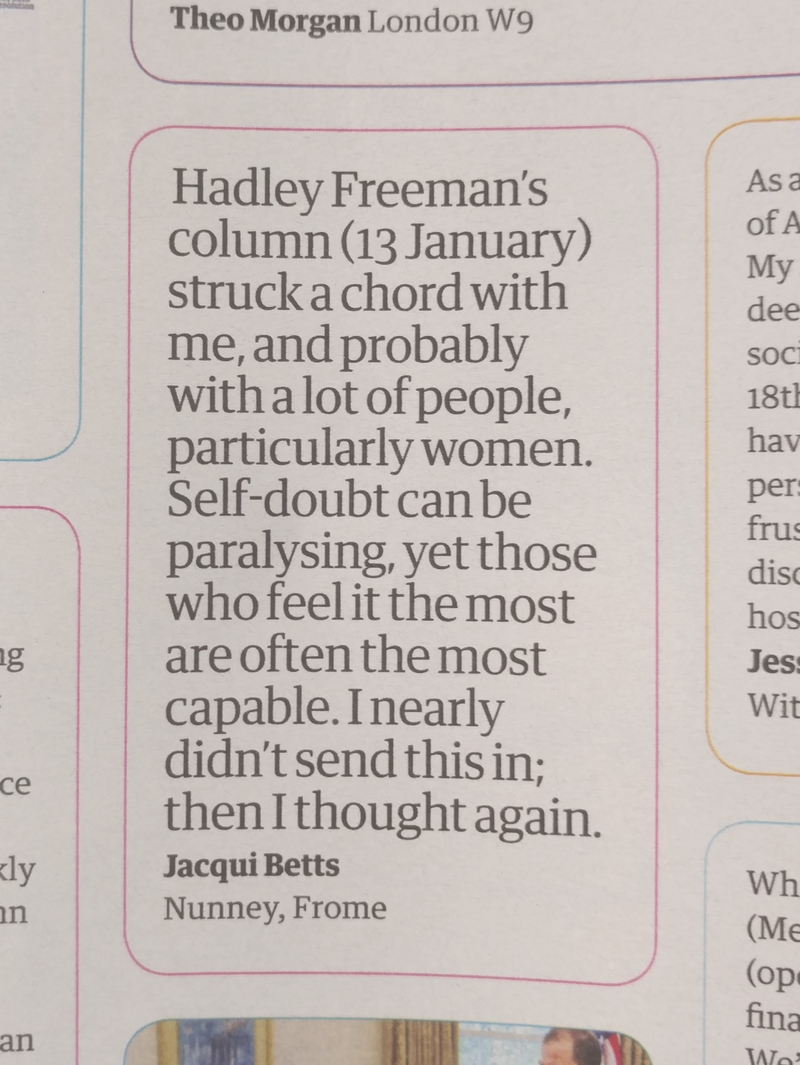
Such matters had been on my mind since I saw the new redesigned Guardian. One particular bit of design had particularly raised my hackles: someone’s cretinous decision to set one of the letters in 20pt type in a narrow column:
You have to wonder, does whoever’s responsible ever actually read anything? Or are words just ‘elements’?
The latter, surely,
given that they
are clearly oblivious
to just how irritating
and distracting
it is to be forced
to read a simple
sentence as a
succession of three
or four word blocks.
It’s like a road designer setting traffic lights at 50 metre intervals along a main highway, sitting back to watch all the cars and buses and vans and lorries stop-start-stop-starting their way along the road, and thinking ‘Nice one! Well done me!’
Tricksy design should be strangled at birth. By which I mean, design that calls attention to itself, saying ‘Hey, look at me! Ain’t I cute?’ If you can see ‘the design’, it’s not cute; it’s just bad design.

